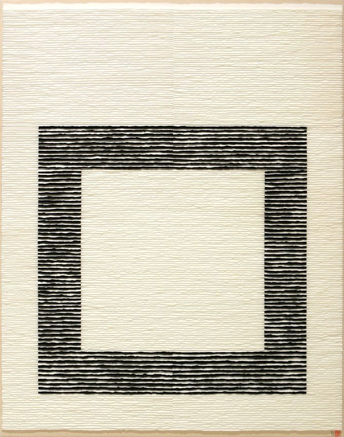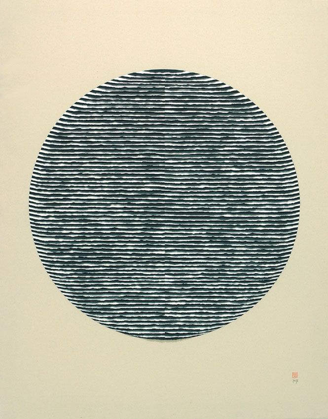
CONTEXTURA
Com este título pretendo aludir ao próprio conceito da palavra; contextura como forma em que estão dispostas as partes de um todo e que se apreende pela vista e pelo tacto ou como configuração, disposição e organização das partes de um todo. Noutro sentido, o acabamento em forma de trama desenhado tridimensionalmente pelas tiras de papel, evidencia um jogo vibrante de texturas visuais e de táteis, que bem nos pode remeter diretamente ao mesmo vocábulo, composto pelas partes e com textura. Quer dizer, por um lado, amplas estruturas geométricas compostas pela união das suas partes, fundo e objeto, e por outro, textura visual e tátil inerente à forma de rasgo manual do papel e da sua disposição em relevo sobre a tela do suporte.
Esta dupla remissão da palavra do título aparece praticamente em toda a minha obra e ao longo da minha trajetória artística, mas nesta exposição destacam-se como novas as obras que, devido à colocação alterna tiras de papel preto e branco, causam uma vibração especial ao olho do espetador. Isto ocorre por uma sucessão de branco e preto em finas linhas paralelas. O contraste é uma antiga regra de composição visual, segundo a qual, a proximidades de duas formas de natureza oposta se valorizam entre si e intensificam a sua comunicação. Desta forma, o contraste como estratégia visual, agudiza o significado, não só excitando e atraindo a atenção do observador, mas também sendo capaz de enfatizar o seu significado para o tornar mais importante ou dinâmico. Os seja, a perceção óptica muda e oscila adotando um caráter móvel.
CONTEXTURE
With this title I intend to allude to the very concept of the word; contexture as the form in which the parts of a whole are arranged and which is apprehended by sight and touch or as the configuration, arrangement and organisation of the parts of a whole. In another sense, the weave-like finish drawn three-dimensionally by the strips of paper shows a vibrant interplay of visual and tactile textures, which could well refer us directly to the same word, composed of parts and with texture. In other words, on the one hand, broad geometric structures made up of the union of their parts, background and object, and on the other, the visual and tactile texture inherent in the way the paper is torn by hand and arranged in relief on the canvas of the support.
This double reference to the word in the title appears in practically all of my work and throughout my artistic career, but in this exhibition the works that stand out as new are those that, due to the alternating placement of black and white strips of paper, cause a special vibration in the viewer's eye. This is due to the succession of black and white in thin parallel lines. Contrast is an ancient rule of visual composition, according to which the proximity of two forms of opposite nature enhance each other and intensify their communication. In this way, contrast as a visual strategy heightens meaning, not only by exciting and attracting the viewer's attention, but also by being able to emphasise its meaning to make it more important or dynamic. In other words, optical perception changes and oscillates, adopting a mobile character.